How to fight customer attrition with the help of data analytics?

Acquiring a new customer is more expensive than keeping an existing one

This is not just an oft-repeated marketing truism. Research cited in the Harvard Business Review shows that the cost of acquiring a new customer can be 5 to as much as 25 times the cost of retaining a customer, depending on the industry. And improving retention rates by just 5% can translate into as much as a 25% increase in profits. So how do we combat customer loss and increase retention? How can data analytics help us do so?

Customer churn (churn or attrition) is an inevitable phenomenon and it is impossible to eliminate it completely. Some customers, regardless of the measures taken against them, leave. For example, because they move out of the company’s area of operation or cease to be a target group and no longer need our product. The remainder, however, give up, opting for a competitor’s offer. These departures could have been prevented. If action had been taken. The right actions, at the right time. The keys are:

  • Predicting the risk of customer departure with sufficient accuracy and in advance
  • Understanding the factors that influence the risk of customer loss

The solution to both problems can be an anti-churn predictive model built using machine learning. Such a model is capable of predicting the risk of losing a particular customer. In doing so, it identifies the most important factors associated with an increase in this risk both generally for the entire customer base and individually for a single customer in his or her specific situation. Such predictive models can use any definition of “churn” and are applicable both to businesses where the departure of a customer is clearly marked in time (e.g., expiration/termination of a contract) and those where the customer simply stops returning and making further purchases.

The most important factors determining customer departure

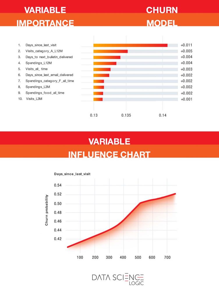
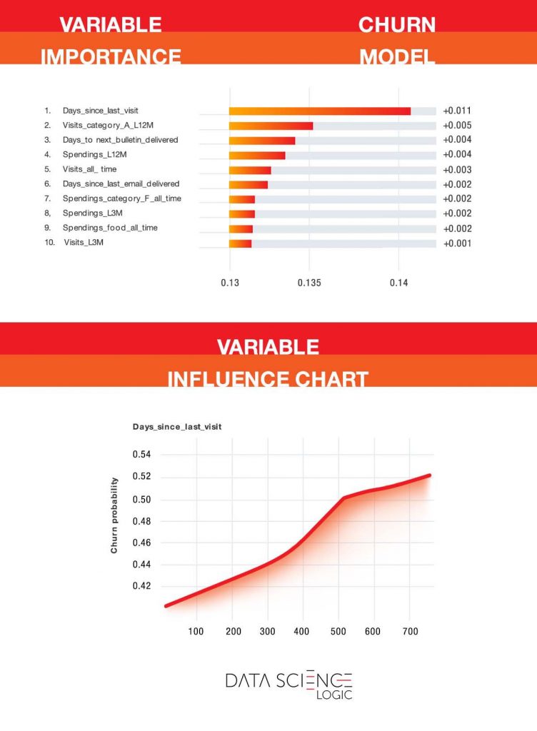
As we mentioned, the predictive model helps identify the most important factors influencing the risk of customer churn. The charts below are from the actual predictive model built on one of Data Science Logic’s contractors. Only some of the variable names (including product category names) have been changed. It is worth noting that this is an industry characterized by a relatively low frequency of purchases (a few times a year on average) and high customer turnover.
Znaczenie i wpływ poszczególnych zmiennych na odchodzenie klienta

The chart at the top shows the customer characteristics that most explain the likelihood of leaving. As you can see, the key variable is the number of days since the last visit with a purchase. This is not surprising. The longer a customer has been gone, the less likely they are to return. However, the model allows you to pinpoint when the increase in risk is greatest and when you need to take decisive action. As you can see in the bottom graph, up to about 365 days the risk increases linearly. After more than one year of inactivity, the risk curve becomes steeper. This is the last moment to undertake an anti-churn campaign.

Also of interest is the second most important variable – the number of visits with a purchase of an “A” category product in the last 12 months. These products are exceptionally well regarded by customers and have a positive impact on customer satisfaction and retention.

In addition to general conclusions about the factors influencing the risk of losing customers, the model allows us to predict the probability of losing a particular person and to identify the specific characteristics that, in his case, increase or decrease this risk, as shown in the chart below. In his case, the risk is relatively low (35.5% compared to the baseline 49.6%). The risk is reduced by, among other things, the average value of the visit and the number of visits over the past year. However, the customer does not use the products of the aforementioned “A” category, which increases the risk of leaving. Encouraging them (e.g., through an appropriate campaign) to try products in this category would likely lower their risk of leaving even more.
Znaczenie i wpływ poszczególnych zmiennych na odchodzenie klienta

Dealing with customer migration is one of the most important challenges facing companies today, given how expensive it can be to acquire a new customer later on. With antichurn modeling, we will learn which customers are likely to leave and why, the signs of increasing risk of leaving, and how best to prevent them from leaving.

How to develop sales coverage with data science

The stationary sales in the vast majority of industries plays a key role. Despite the observed dynamic growth of e-commerce, this will not change in the coming years. The opening of a new point of sale usually entails a significant investment related to the construction or rental and adaptation of premises, recruitment of employees as well as changes in logistics. Additionally, the potential negative impact of a new outlet on the existing ones is significant. Therefore, decisions to expand the sales network are associated with high risk. In today’s article, we will show how data science combined with geospatial data can help mitigate these risks and facilitate better decisions.

Key questions

In the context of point-of-sale locations, questions that data science can help answer include:

1) Is this a good place to open a new store? 

2) Will the new store not “cannibalize” the sales of my existing stores?

3) How many stores should I open, where should I open them, what should the optimal network look like?

4)Which stores should I close? What will be the net effect of closing a store?

5) Is the existing store using the potential of its location?

6) If I don’t open a store in a particular location but a competitor does, will my existing stores be negatively affected? Which ones? How much?

Today I would like to focus on the first two questions and show you how data analysis can help you make the right decisions.

Data, data, data…

To begin with, it is worth taking a moment to look at the sources of the data used in the analysis. These can be divided into internal data and externally necessary data. Key internal data includes:

– historical sales data, 

– outlet characteristics (space, nature of location – gallery, stand-alone, etc., range of assortment available)

– local activity (promotions, media presence, leaflets, newspapers, billboards),

– address data of points.

The data that need to be obtained from outside are mainly:

– data on population, demographic characteristics (age group distribution, gender), income and purchasing power,

– Data about the road network, its quality/class and traffic volume,

– geolocation of competition points,

– travel time to own and competitors’ outlets by different modes of transport (depending on the nature and density of the sales network, different modes of transport may be relevant).

Some data may be available only at the level of the whole municipality (especially data from the Central Statistical Office), but where possible data of the highest granularity should be used. There are sources from which data can be obtained for individual address points (specific blocks). 

When analyzing and presenting data, a reasonable compromise between detail and total may be a so-called kilometer grid. The map is then divided into squares of 1km side length. Examples of such maps will appear later in this article.

Why is accurate geographic data important?

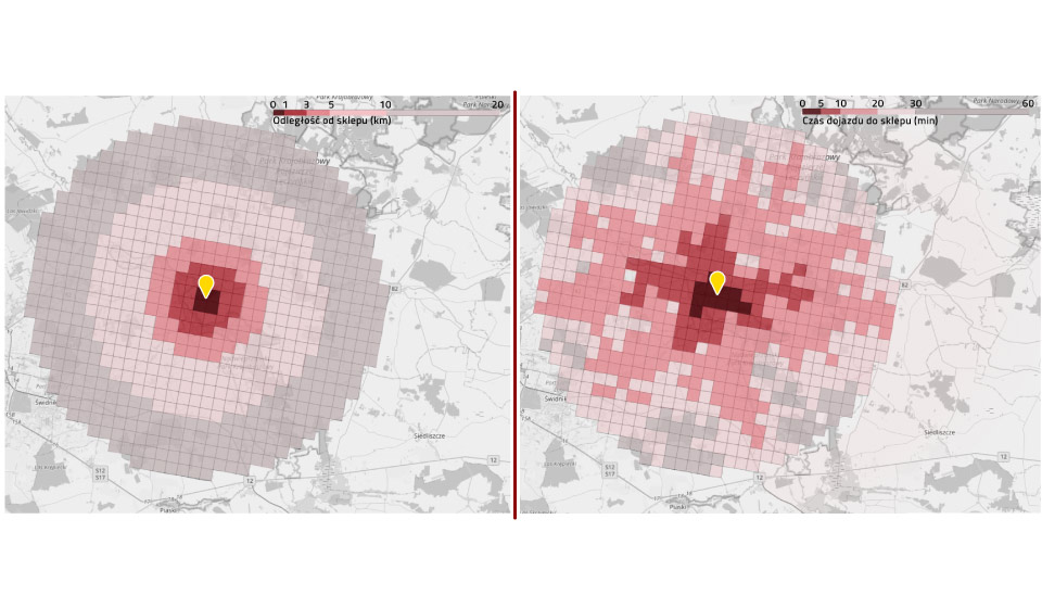
Below is a simple example of the differences in conclusions that can be reached depending on the data available. The map on the left shows the distance from the store (up to 20 km). This is a very simple measure to calculate. One might think that it would be a sufficient approximation of the time to get to the store. Unfortunately, as you can see in the map on the right, taking into account the distance from the store alone is misleading. Only showing the actual travel time on the map shows a realistic picture of the store’s range. It can be seen that the store’s range extends along traffic routes (in this example, radially spread), and areas that are close to each other in reality may have different travel times. Over-simplification and abandonment of accurate geographic data leads to incorrect estimation of store potential and potentially wrong decisions.

Porównanie odległości od sklepu z czasem dojazdu do sklepu. Większa odległość nie zawsze oznacza większy czas dojazdu

In which direction is it profitable to develop a chain?

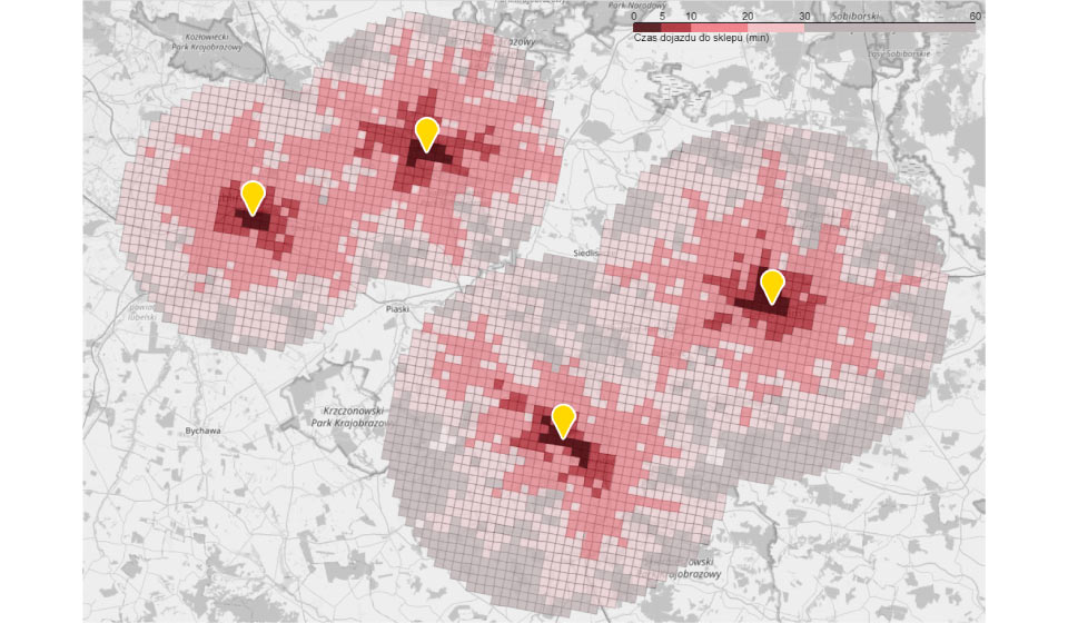
We will now analyze the example of a chain currently consisting of 4 stores. On the map below you can see their range. From each area (square) the travel time to the nearest store has been calculated. The management is considering various scenarios for further development. One of them is to fill the “white spots” in the network coverage. Such a move could be interesting for at least two reasons. First, there is a town in the area with what appears to be demographic potential where a new outlet could be located. Second, a new store created between existing stores could fit perfectly into the existing logistics chain.

Mapa sieci sklepów wraz z zobrazowaniem czasu dojazdu do sklepu

To base the decision on data, an estimation of the new store’s potential is made and its impact on the existing network is simulated.

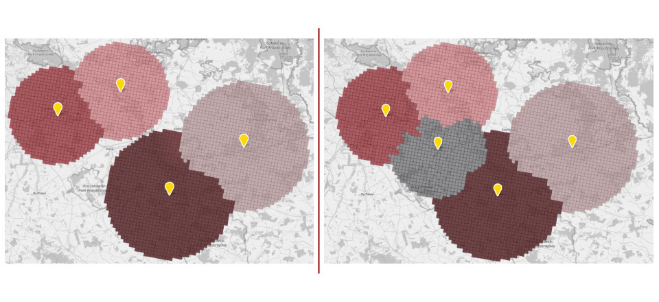
The map on the left shows the range of stores before expansion. Areas were assigned to the store with the shortest travel time. The map on the right illustrates how the coverage of existing locations will change after the network expansion and what the coverage of the new outlet will be. It can be clearly seen that the overall network coverage will be expanded to include new areas. You can also see that the areas of all but one of the existing stores will be slightly depleted. However, a visual assessment and map analysis is not enough to make a decision. Precise forecasts are needed. Only accurate numbers will allow to estimate the profitability of the considered investment.

Kanibalizacja istniejących punktów sprzedaży

Predictive model

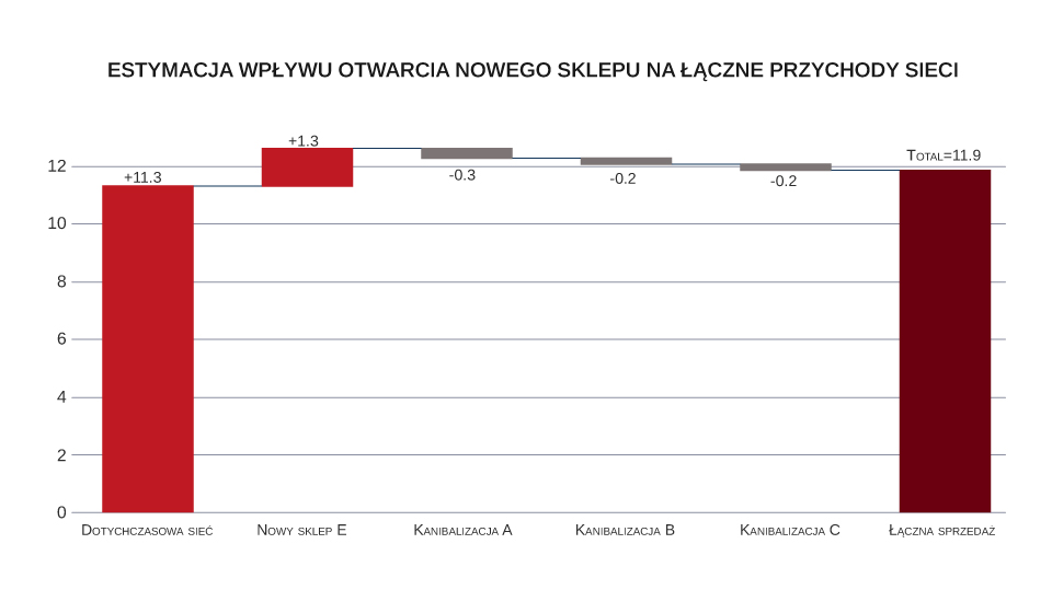
With help comes a predictive model built on machine learning. Using a wide range of available data (sales, demographics, geography), the model allows for accurate estimation of a new store’s potential and its impact on existing outlets. The graph below shows the modeling results. The bar on the left (‘Existing chain’) represents the baseline, i.e. the projected sales level of the entire chain if the new store had not been launched. The next bar is the sales estimate for the new outlet. The result shows that it will increase the potential of the chain. However, compared to others, its contribution will be relatively lower. The new outlet will increase the chain’s turnover by about 12%. The next bars show the cannibalization of sales in the existing points. As could be guessed from the map analysis, 3 out of 4 stores will be affected by cannibalization. It may seem that no store will suffer significantly – on average only by about 6% of turnover. However, it will account for as much as 54% of the new outlet’s sales. Thus, most of the new store’s turnover would be realized at the expense of the existing stores, and the incremental impact of the new point on the chain’s total turnover would be only about 5%.

Estymacja wpływu otwarcia nowego sklepu na łączne przychody sieci

The final decision about the profitability of investment in opening a store in the considered location requires comparing incremental turnover (and margin) with the necessary expenditures and operating costs. The analysis should also include a margin forecast, as it may turn out that the new store will differ from the existing ones in terms of a typical basket of products and, consequently, their margins. It is certainly worth considering other potential locations, as the return on investment there could turn out to be higher. Additionally, the possible actions of potential competitors should also be taken into consideration. The most appropriate course of action would be to conduct a comprehensive analysis and simulation covering many potential locations.

Modern optimization methods, which we use on a daily basis in Data Science Logic projects, allow us to simulate many parallel scenarios and find the optimal shape of the network. Thanks to this, they are able to indicate which locations are worth opening and which should be closed. The final decisions always belong to people, but precise data combined with appropriate methods of analysis can help to make them.

Want to know more about customer traffic in stationary stores? Read the details of the hourly traffic forecast project and see how it will help increase sales.

How did we achieve 30% better sales through data science?

Finding a compromise between maximizing profits and reducing costs is not an easy task for marketers planning marketing campaigns. For campaign ROI it is crucial to choose the right group to target. With help comes uplift modeling, which examines the likelihood of customer purchase. 

The middle of summer. A bit of a “dead” season. Conversations in the marketing department of one of the largest retailers in Poland concern not only impressions from vacations, but also how to stimulate sales a little. One of the employees suggests running a text message campaign. There is a consumer base that can be communicated with. There is even quite an attractive offer that can be written about. Nothing else to do but send it. A problem arises, though. The end of the financial year is approaching, so there is not much money left in the budget. Enough to hold a mailing to at most one-fifth of the base. Enthusiasm has subsided – there will be no fireworks. But what can be done to make the most of the limited budget and maximize the chances of achieving a noticeable effect? Someone comes up with an idea to get on to friendly data science consultants. Time is short and one should to act fast, but the experienced Data Science Logic team takes up the challenge.  

Can we predict the purchase?

We can describe consumers in the database on nearly 200 variables: in terms of transaction history, assortment purchased, price sensitivity, propensity to buy online, interaction with marketing communications, and visits to the retailer’s website. Analysts build a scoring model predicting the likelihood of interest in the promoted assortment for each consumer who could potentially be contacted. 

The available budget will be divided into two parts. Half of the consumers will be selected in the existing way. The other part will be the 10% of the most interested consumers according to the model’s prediction. Additionally, from among all those qualified for the mailing, a control group will be drawn, which will not receive the message. This division allows us to measure the effectiveness of the two targeting methods and the effect of the communication itself. 

Results: conversion rate in the group selected by the model is nearly 3 times higher than in the group selected by the previous method. The results speak for themselves. Data science wins. Or does it?

Are we sure we are looking at the right indicator?

The conversion comparison shows that the model correctly predicted a group of consumers above average interested in buying. But were not these customers who would have completed the transaction anyway even without the text message? What was the actual impact of the mailing on their tendency to buy? We can find answers to these questions by making a comparison with a control group randomly excluded from the communication. It shows that the difference between the conversion in the entire messaged group and the conversion in the control group was about 1.8 percentage points. The difference is still in favor of the model, but is no longer so spectacular. This means that some of the consumers identified by the model were already sufficiently interested in the purchase before the communication, and there was no need to stimulate them additionally. So how can we classify consumers in terms of their expected response to a marketing communication?

Modelowanie uplift

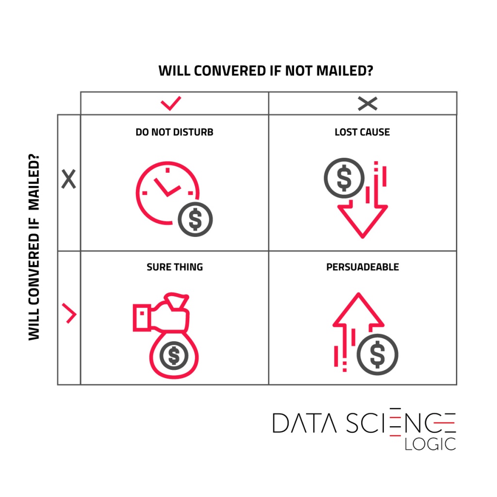
The top left part is the people ‘Do not disturb‘ group, who would have been interested in the transaction, but disturbed by the unwanted communication abandon the purchase. The ‘Lost cause‘ section are consumers who we cannot convince to buy, even with a planned campaign. The ‘Sure thing‘ group are people willing to buy even without communication. Finally, the lower right square ‘Persuadable‘ group that is not yet convinced to buy and the campaign stimulus is able to impact the decision. So we have one group that is worth communicating and three that are not. But how to predict who is in this profitable group?

The uplift model

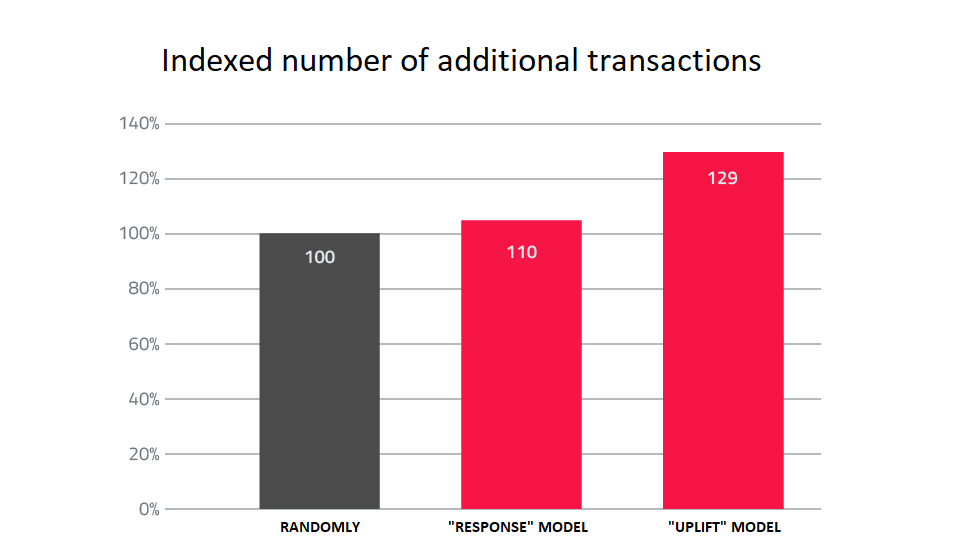
Again, data science comes with help. It is possible to build a model that will predict not so much the propensity to buy as the change of this propensity under the impact of communication. This is the so-called uplift model. The prediction of the model allows to rank consumers from those with the highest increase in purchase probability to those with the lowest (or even negative) change in interest in the transaction. Data scientists build an uplift model based on the data collected in the first mailing. Its application in the next experiment brings further increase of uplift – by almost 0.4 percentage points in comparison to the group selected by the response model. Seemingly little, but with the appropriate scale of the database translates into a significant number of additional transactions generated. Compared to the previously used selection methods, the response model generated 10% more additional sales, and the most advanced uplift model generated almost 30% more.

What we buy, spending the budget on communication with consumers, are in fact additional conversions that would not be achieved if it were not for the campaign. Properly selecting the group communicated, we can with the same budget generate significantly more incremental purchases. Uplift predictive modeling available among data scientists tools can be a significant help here.

NPS Survey – an Effective Tool to Optimise Marketing Communication

NPS (Net Promoter Score) survey has been known for nearly 20 years. Described in a Harvard Business Review article by Frederick F. Reichheld, NPS was well received by marketers and was adopted by many industries. It is estimated that up to two thirds of the largest US companies (included in Fortune 1000) use NPS.
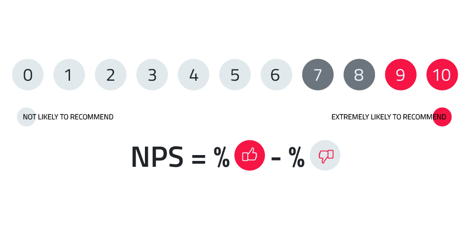
The basic version of the survey includes only one simple question: On a scale of 0 to 10, how likely are you to recommend the company to a friend? 

The respondents who answer 9 or 10 are referred to as promoters. They are brand ambassadors. They are worth pursuing because each one of them recommends the brand to up to 3 more people. Those with a score of 0 to 6 are detractors — unhappy customers tend to tell about it to 9 other people. The scores of 7 and 8 are considered neutral and are disregarded in determining the final score.

Advantages of the NPS survey

The NPS customer loyalty evaluation tool has several important advantages. Above all, these include a relatively simple survey, to which a customer can respond easily (the questionnaire is short and the question is simple) and an uncomplicated way of calculating the result. More important, a significant correlation has been shown between NPS and revenue growth rates. The examples for various industries can be found, among others, in the aforementioned Reichheld’s article. The analyses conducted on the Polish market show a relationship between the consumers’ NPS score and their purchasing behaviour, and even their inclination to interact with a brand. In today’s episode of the ‘We Love Data, So Let’s Date’ series, we would like to present one of such analyses.

In this article, we will focus on the opportunities offered by the analysis of de-anonymised responses given in an NPS survey. You must also remember that the lack of anonymity here does not mean knowing the respondent’s exact personal data, but rather being able to track their subsequent interactions with the brand, their purchase decisions and linking them to the NPS score. Is it possible to clearly determine to what extent the knowledge of a consumer’s attitude towards a brand expressed in an NPS survey can help optimise and personalise marketing communications?

Survey Conducted by Data Science Logic

The presented results come from a study conducted on a sample of over 20,000 participants of a loyalty program of one of the largest retailers in Poland. We took into account the participants’ behaviours and their interactions with the brand in a period of 6 months after completing the survey. Thanks to an extensive consumer identification system, it was possible to track participants’ actions in various channels, including purchases in brick-and-mortar stores, online purchases, visits to the brand’s website, interaction with mailings (open rate, click rate) and text messages, as well as interactions with digital ads displayed on external websites.


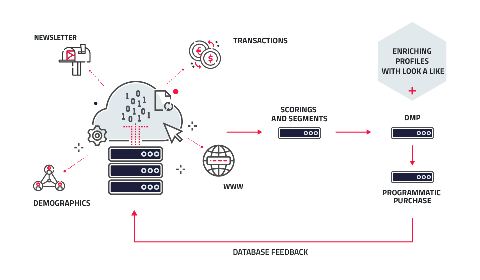
General diagram of consumer data flow

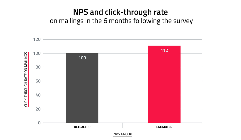
The conclusions from this study confirm the previously quoted observations and theses that point towards a definitely higher value of customer who displays a positive attitude towards the brand. The greater value of the customer-promoter is also influenced by their openness to communication activities conducted by the brand. Promoters had a 12% higher click rate compared to detractors. So they were clearly more likely to read the newsletter content and respond with clicks. 

In order to facilitate the analysis of the results of this survey, the numbers in the above graph, and in the following ones presented in the article, are indexed in such a way that the values of the analysed feature for detractors is set at 100, and its value for promoters is proportionally higher or lower.

Higher click-through rates on mailings linking to a website or e-commerce site translated into a higher number of sessions on the website by up to 37%.

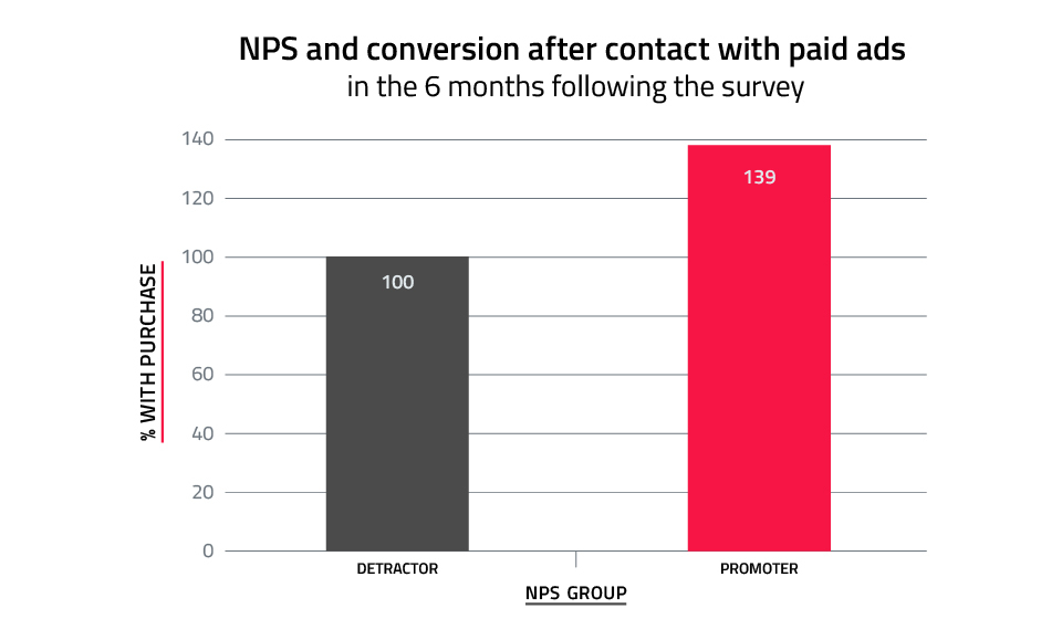
As it turns out, promoters reacted much more actively to brand messages in external media. Compared to detractors, they had nearly 40% higher interest in the communication after exposure to digital ads.

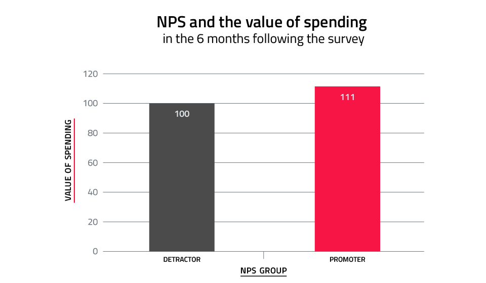
Positive attitude towards the brand, significant openness to newsletter communication and a greater willingness to respond to advertising messages translate into higher customer spending. In the period of 6 months after completing the survey, the promoters spent 11% more compared to brand detractors.

It is worth noting that this difference is the result of both higher frequency of transactions and higher average value of a single transaction.

So How Can You Use the Insights from NPS Analysis to Communicate More Effectively?

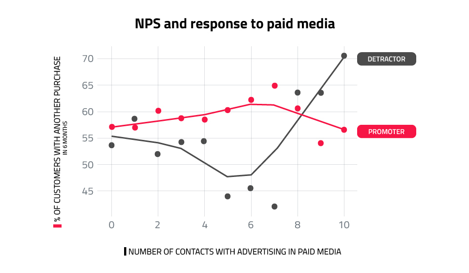
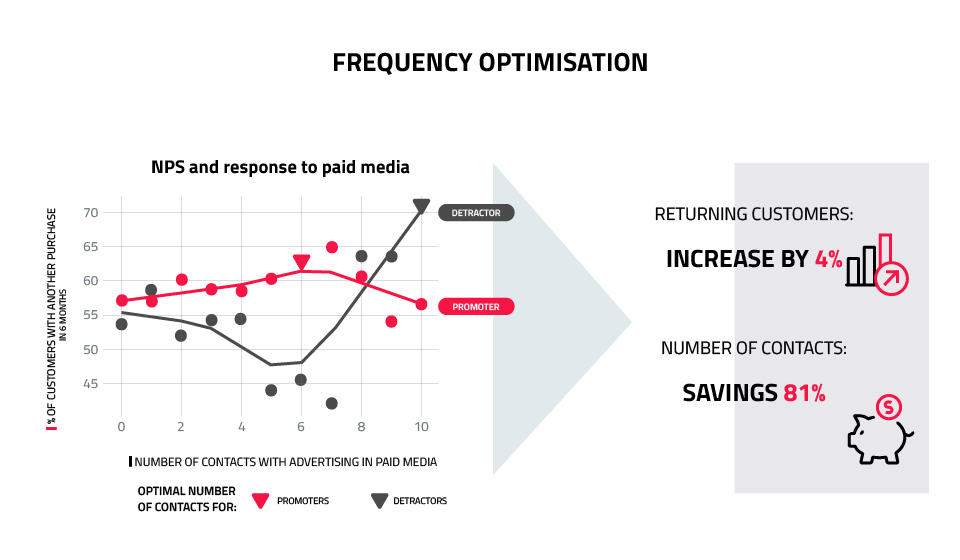
Data Science Logic decided that one idea in particular is worth verifying, i.e. how the adjustment of the frequency of paid media exposure impacts the consumer’s most recent NPS score. This proved to be an interesting lead. Based on the data analysed, it was clear that promoters and detractors respond differently to escalating communication intensity. Their ad saturation curve is completely different. In the case of promoters, increased frequency of exposure initially results in an increase in response. Advertising message overload was achieved with 6 contacts. For detractors, however, the initial effect of increasing the number of contacts was negative. Only after exceeding 8 ad displays the effect was comparable to the promoters group.

Using these observations to optimise the number of ad displays, you can assume 6 is the limit for promoters. If you have not convinced the promoter within this time, you should let go of further attempts. This saves budget and reduces the risk of over-saturating the consumer with ads, thus preventing the promoter to join the group of unhappy customers. However, you should adopt completely different guidelines for detractors. In their case, it pays to aim for 8 or more ad displays. By applying the described optimisation, you could significantly reduce the number of contacts and save up to 80% of the budget, with the same effect (or even potentially slightly better, i.e. by 4%). Our analysis assumes that we only affect the frequency of communication, leaving everything else unchanged.

Further efficiencies can be gained by also testing the differentiation of consumer-facing content depending on the consumer’s last and previous NPS score. This applies to both paid advertising and communication based on own media: mailing, text messages, website personalisation.

Summary

So, to sum up the presented results, it should be noted that they depend on the conditions specific to a particular company, e.g. on the industry, frequency of purchases, nature and activity of the competition, consumer features. It is therefore worth conducting a similar analysis using your own data. To do this, you will need an NPS survey, conducted systematically in a way that allows you to link responses to a consumer identifier, and covers a wide range of channels in which consumer interactions with the brand are tracked. The wider the range of points of contact with the brand, where you can register consumer behaviour, the greater the possibilities to optimise the activities. NPS survey data can be a valuable addition, opening up additional opportunities.

Net Promoter Score is more than just a question. It allows you to get to know your customers better. NPS is a strong indicator of loyalty and, as it turns out, can be used to optimise marketing communications. Asking one simple question will help you reduce your paid media costs and reach the right customers with the right message. Of course, as long as you combine the answers you get with other valuable information about your customers.